Flora Therapy
From word of mouth to a brand that speaks for itself.
Problem
Flora Therapy was fully booked within three months, purely through word of mouth. The brand hadn't kept up. A generic logo and website that looked like every other allied health provider. But the real issue was trust. Parents of neurodiverse children make high-stakes decisions. The brand needed to make them feel safe and confident before a single conversation had taken place.
Solution
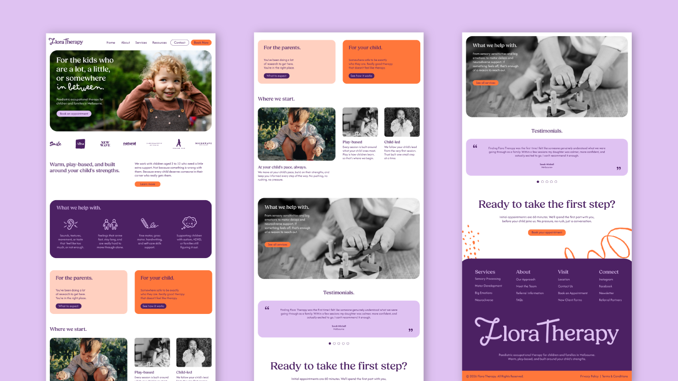
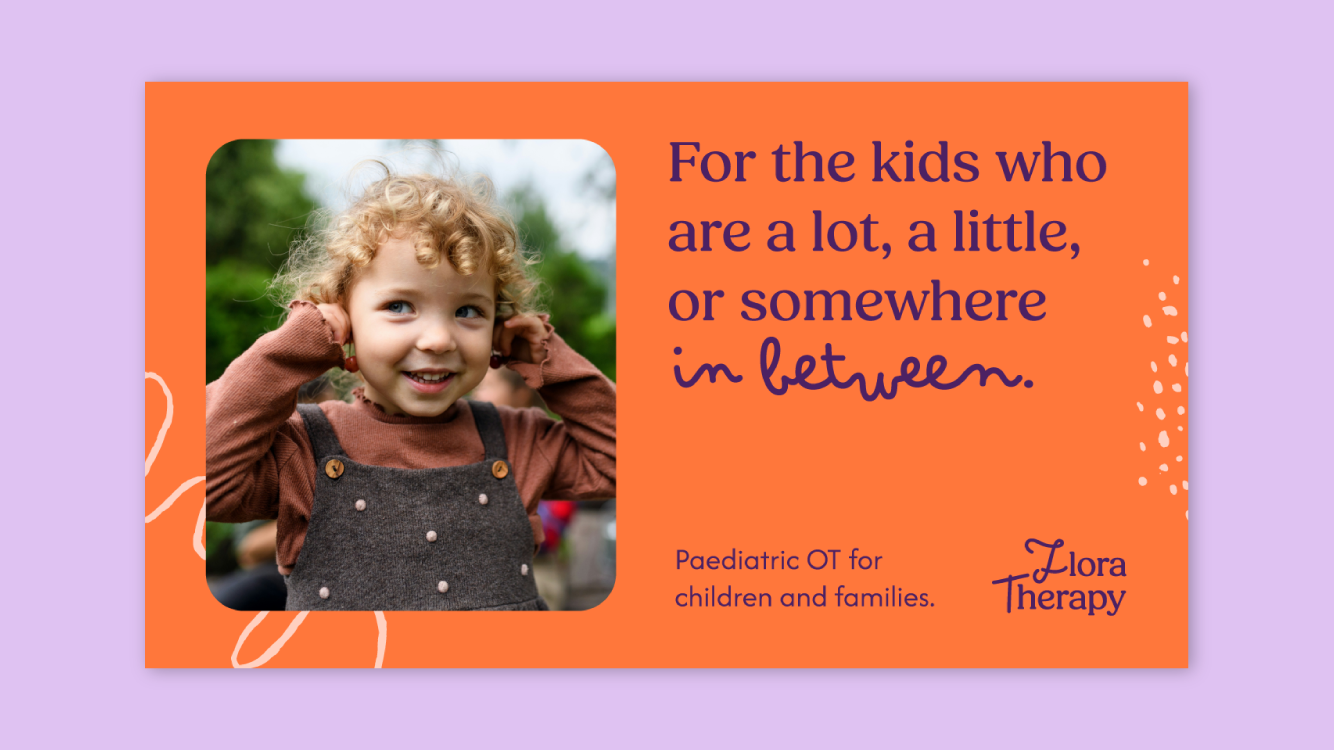
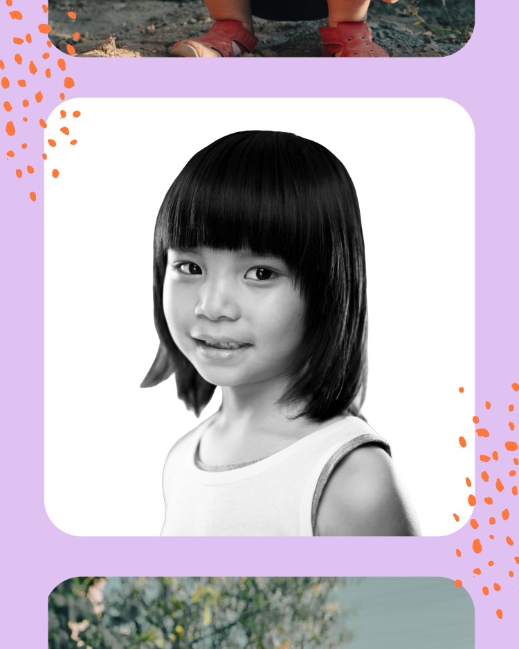
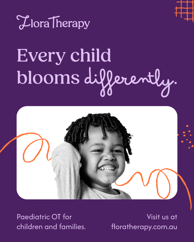
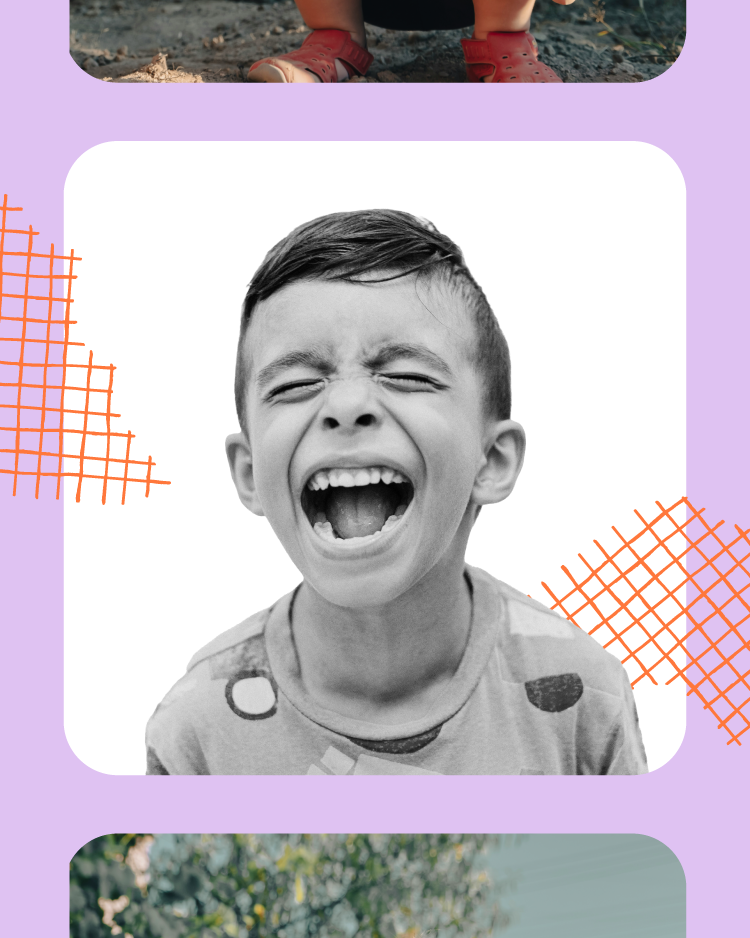
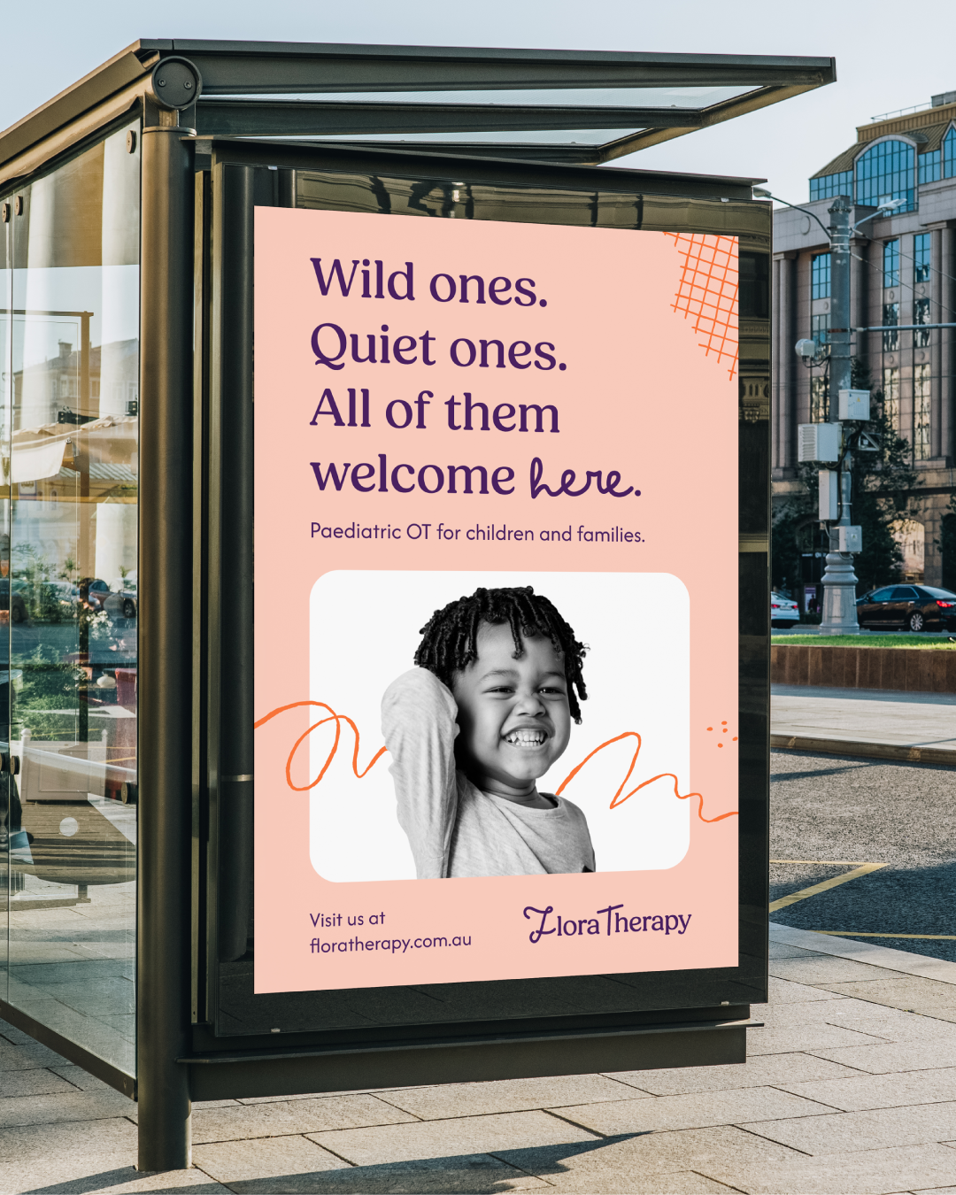
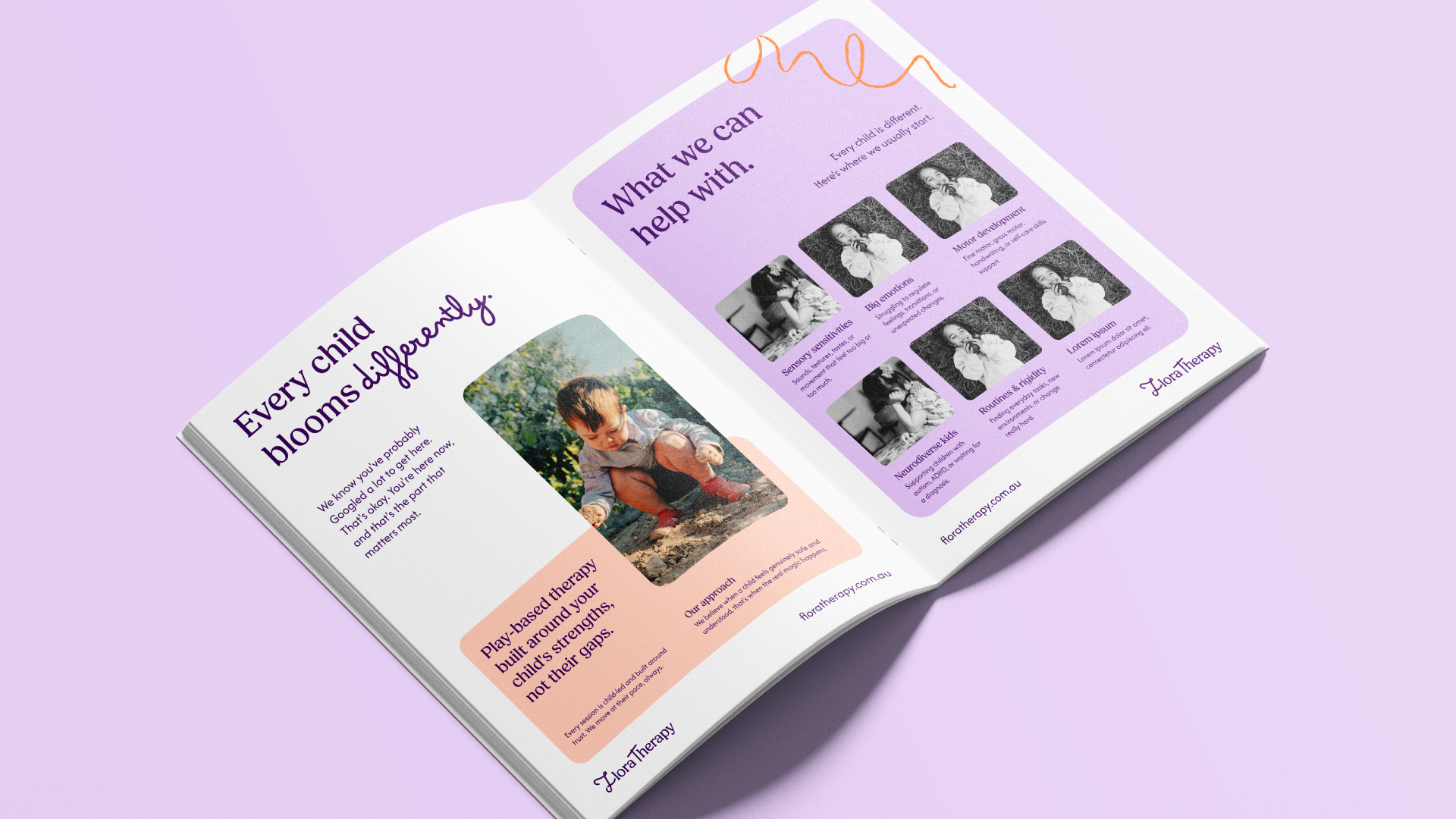
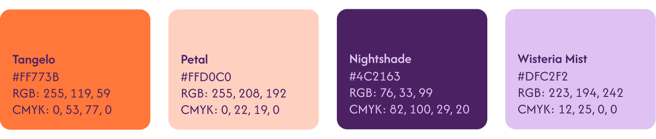
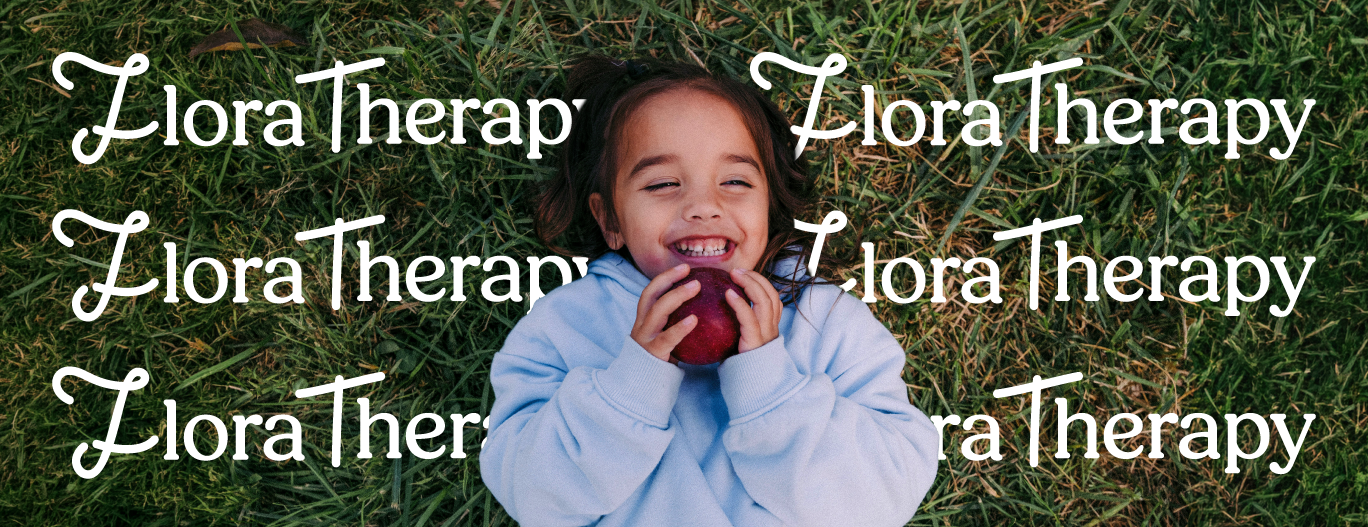
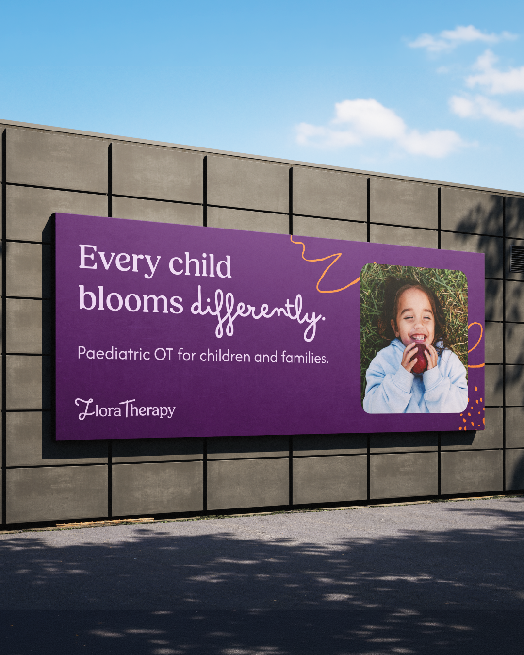
Hand-drawn botanical elements, the handwritten typeface Bimbo Pro, and a palette of deep purple, warm orange, soft blush, and dreamy lavender bring a childlike warmth and human quality to every touchpoint. The website was built to reassure anxious parents before they'd read more than a headline. The welcome pack was designed to reduce anxiety before a family even walked through the door.
Note: Flora Therapy is a conceptual project created by KyoLou Studio to demonstrate a full brand strategy and identity process.
Services
Brand strategy and foundations | Logo suite | Colour palette and typography system | Brand guidelines | Hand-drawn graphic elements | Website design | Patient welcome pack | Social media templates | Digital banners