Talent Run
Evolving a single-colour brand into a bold, flexible system that stands out and scales.
Problem
The brand relied on a single, highly recognisable colour (electric blue), limiting flexibility. DIY application resulted in a lack of visual clarity and professionalism, limiting recognition and weakening engagement with its creative audience.
Solution
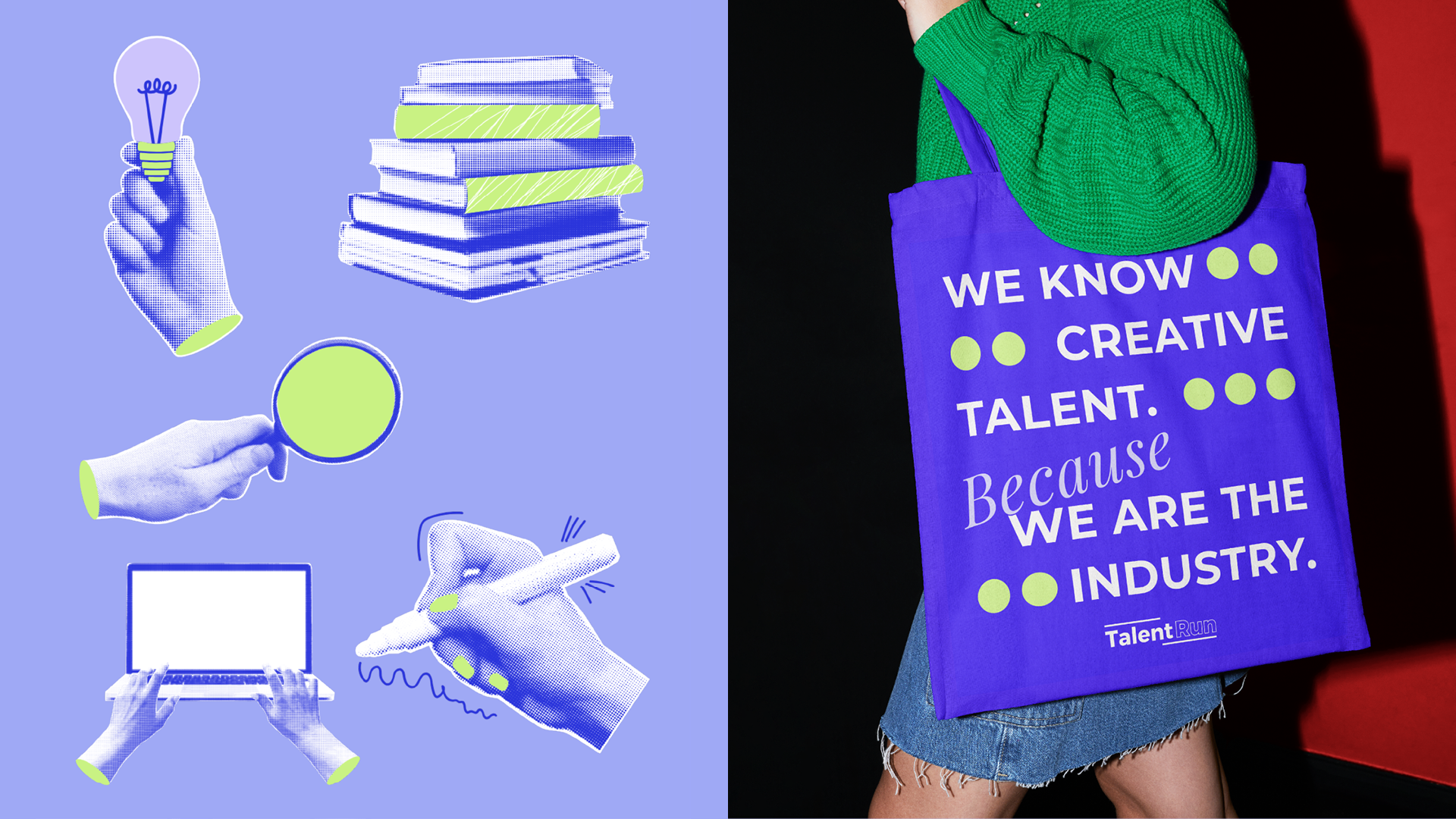
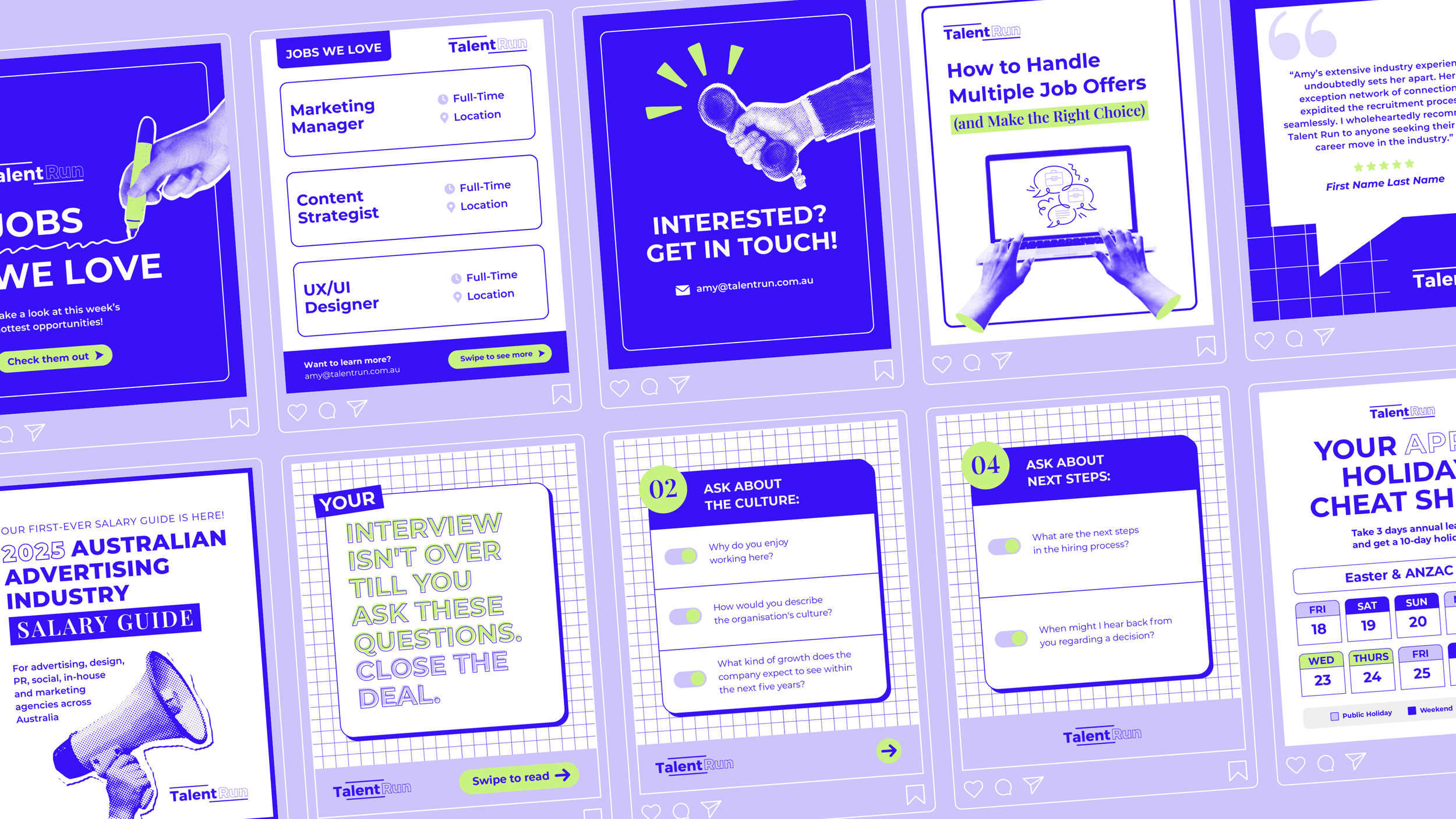
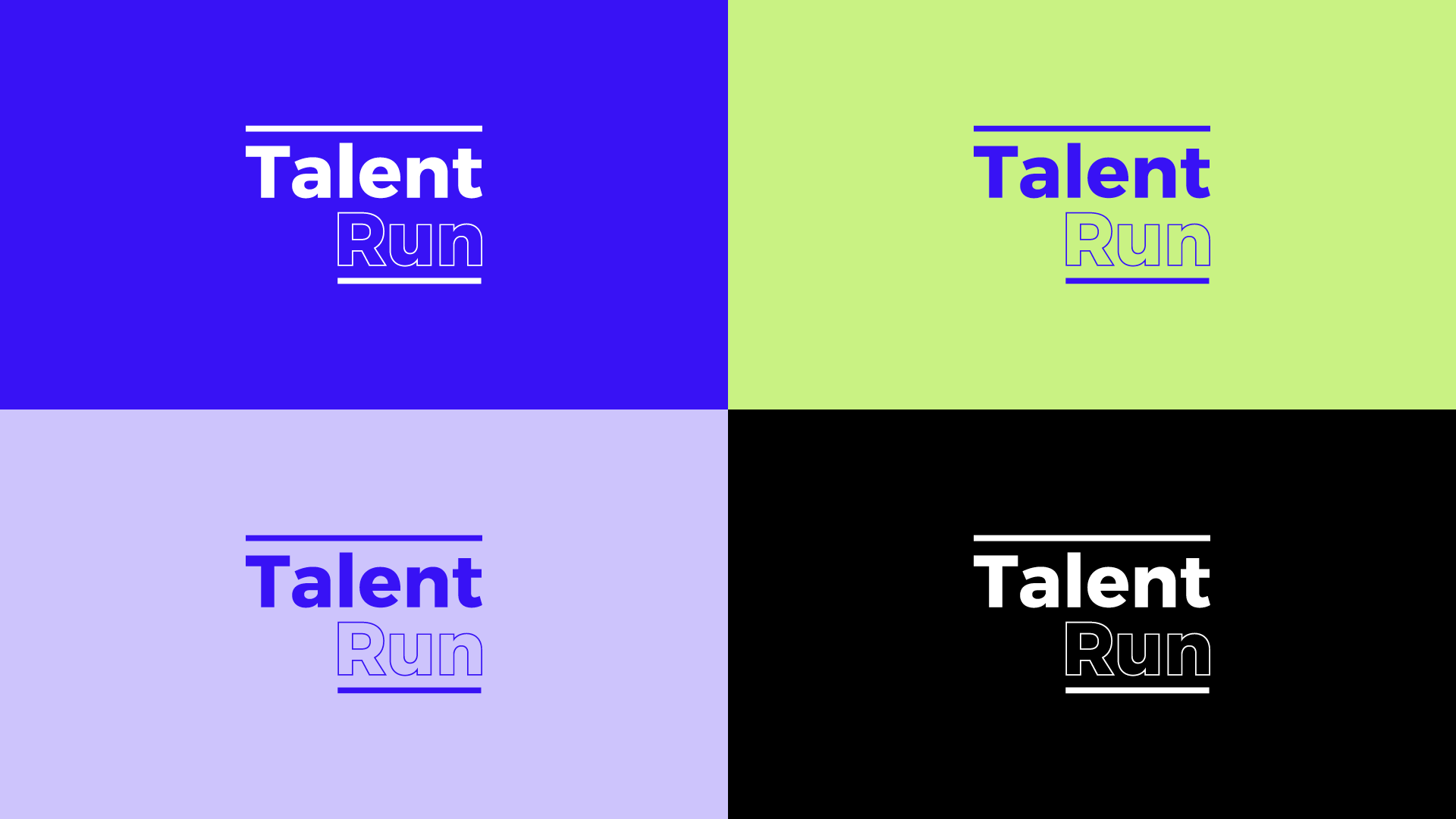
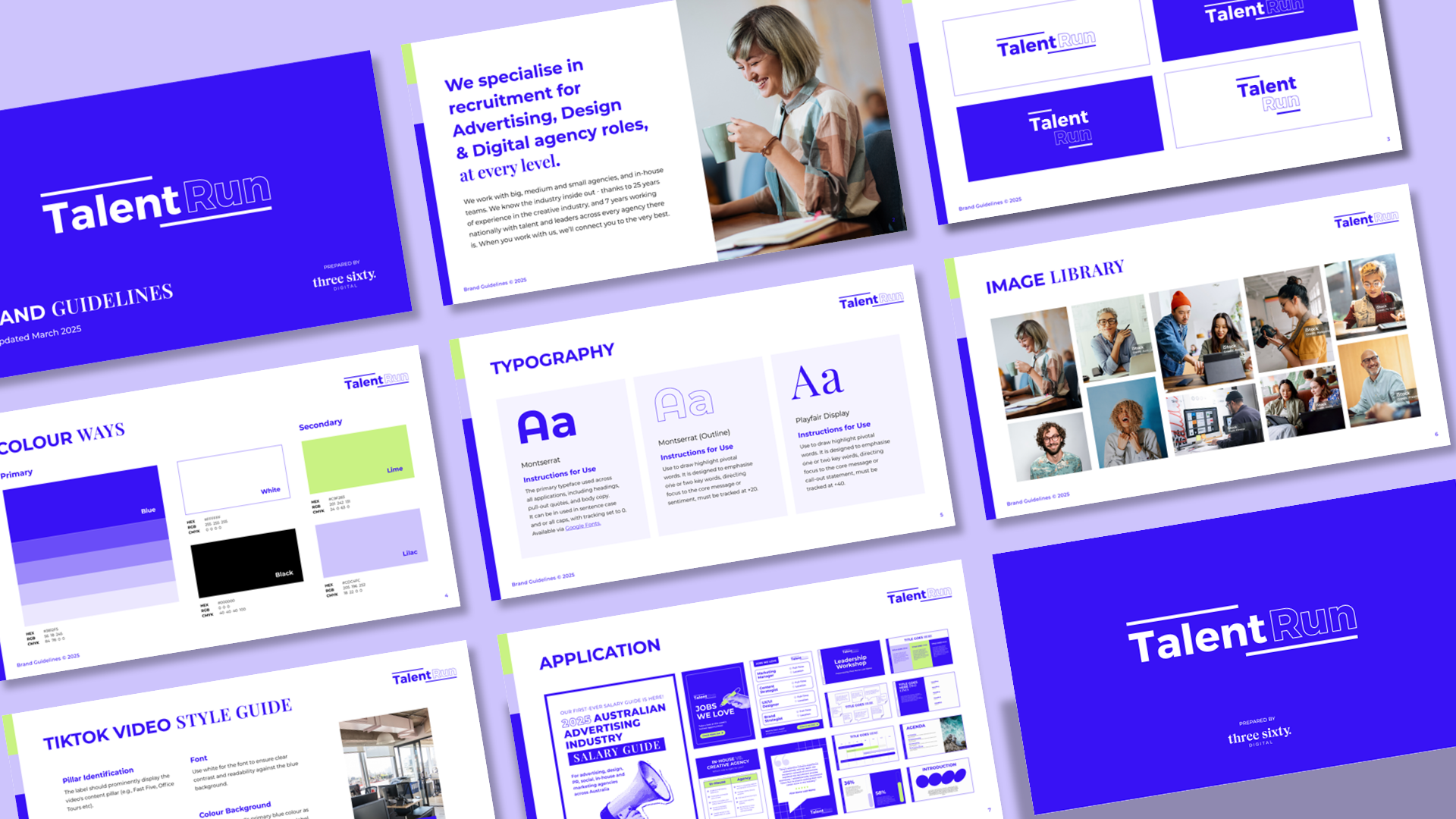
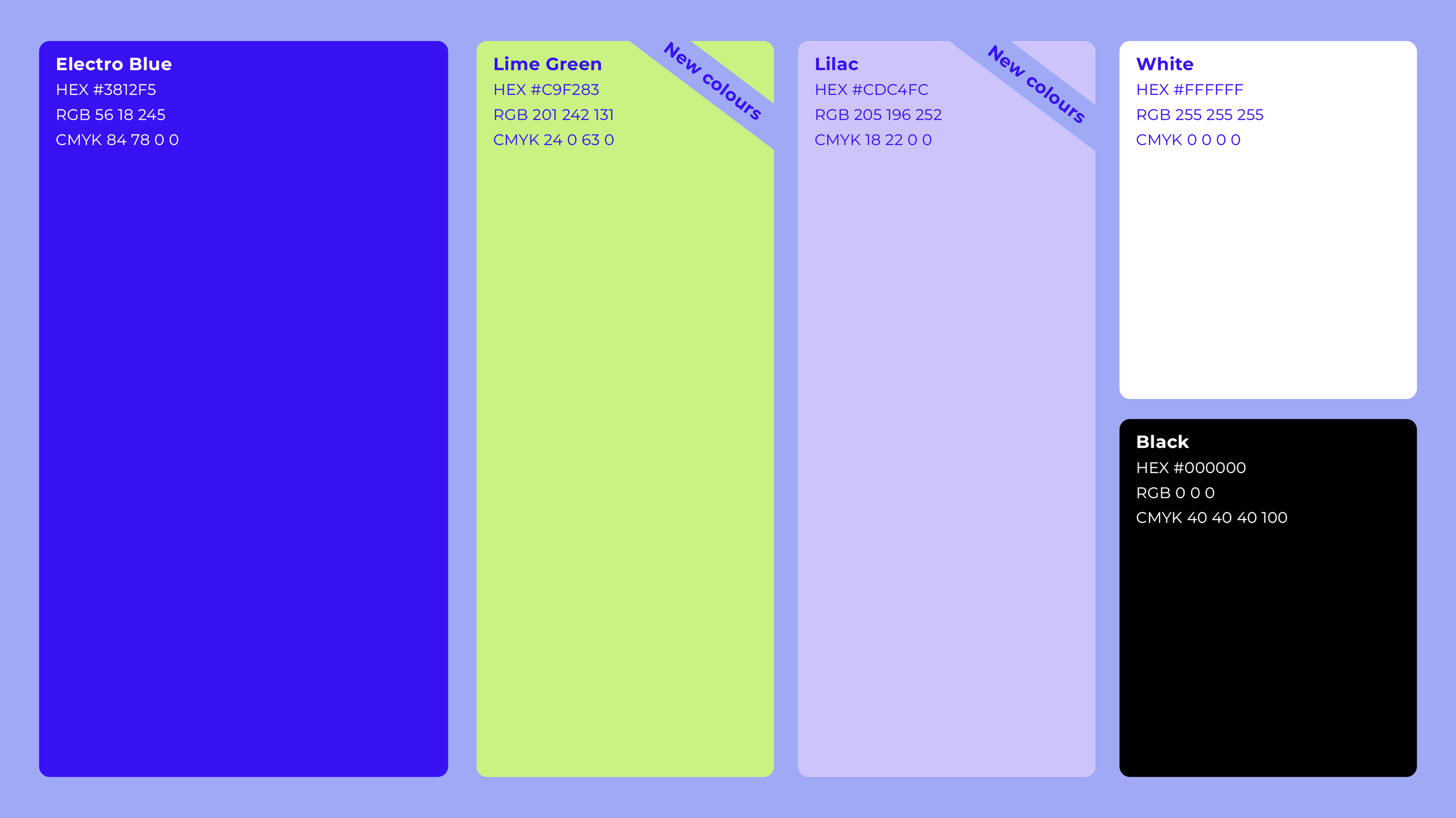
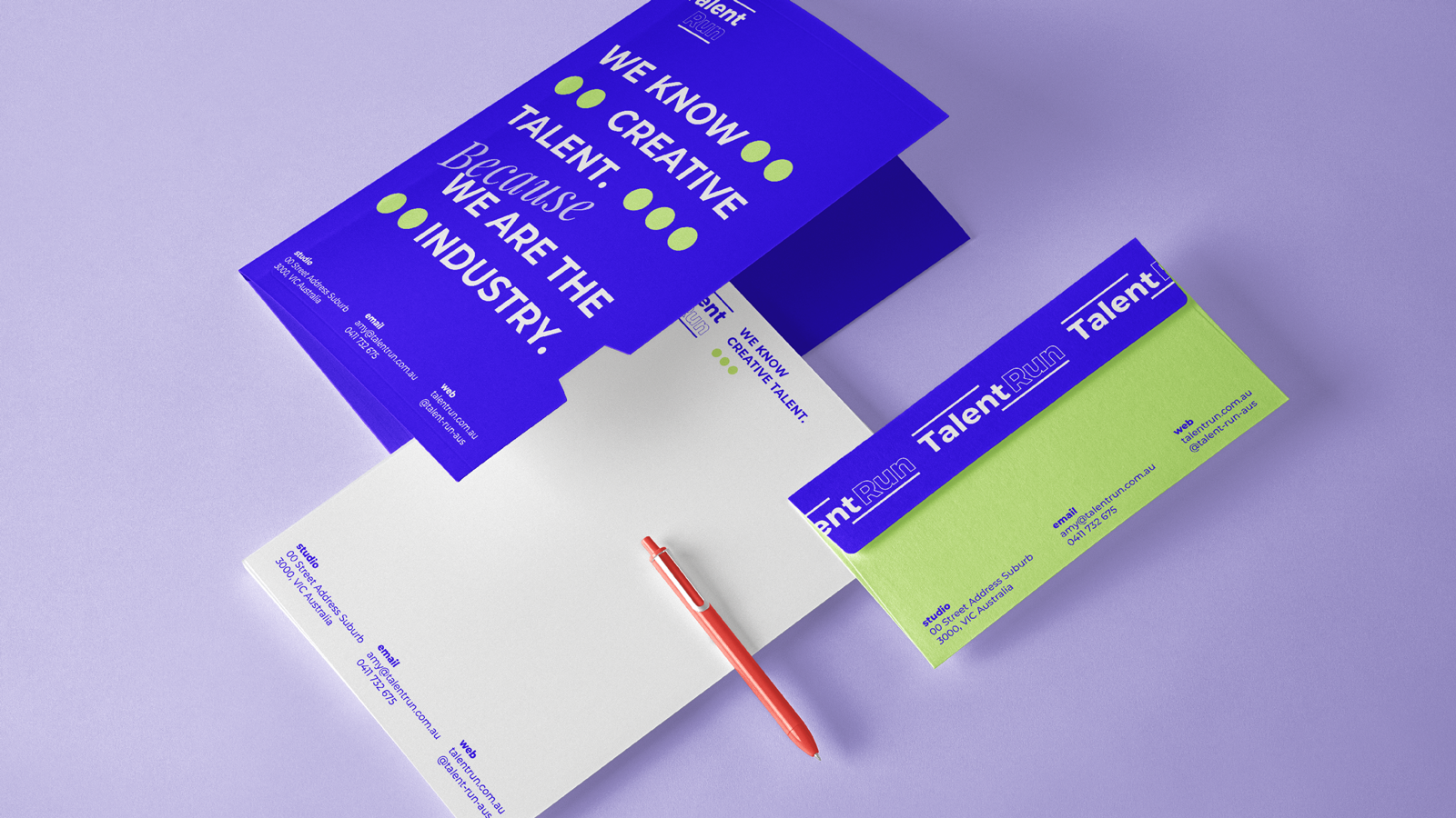
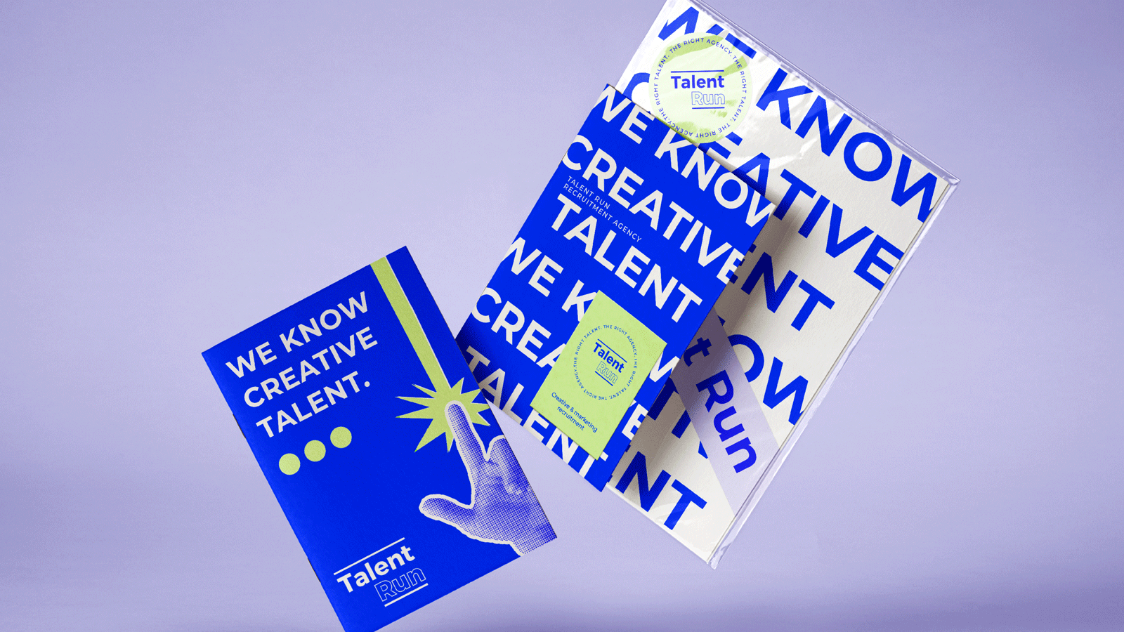
I expanded the colour system with supporting accents, introduced a bolder typographic hierarchy, and defined a distinctive imagery style using halftone, newsprint-inspired graphics. The refreshed system adds flexibility and creative edge while strengthening brand recognition, credibility, and engagement with creatives and marketers.
Services
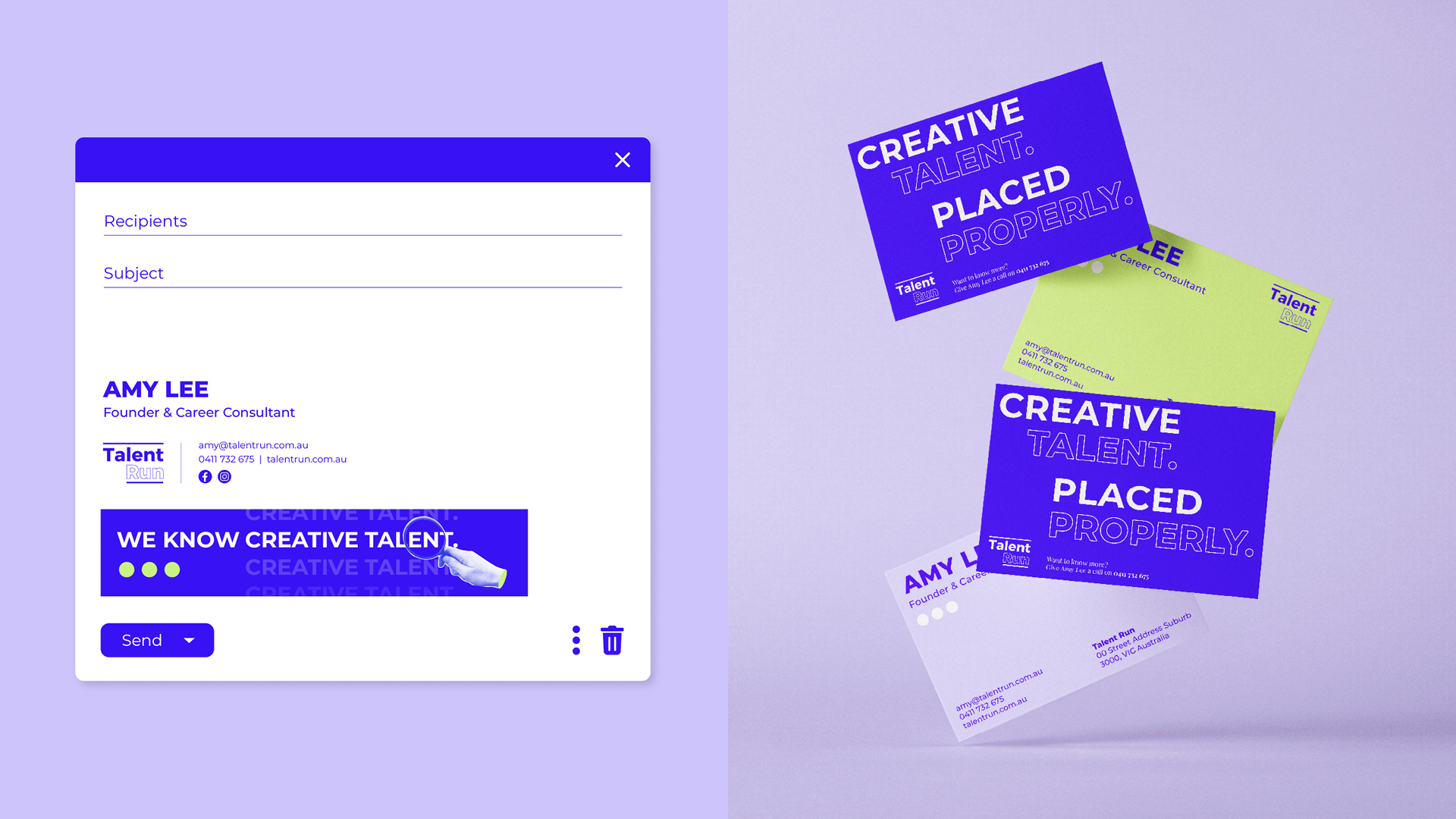
Brand guidelines | Refined colours and typography | Supporting graphics | Social media content | Canva templates | Business cards and email signatures