Illustrated ‘Hands’
How I turned the way I think into a visual language for my brand.
Problem
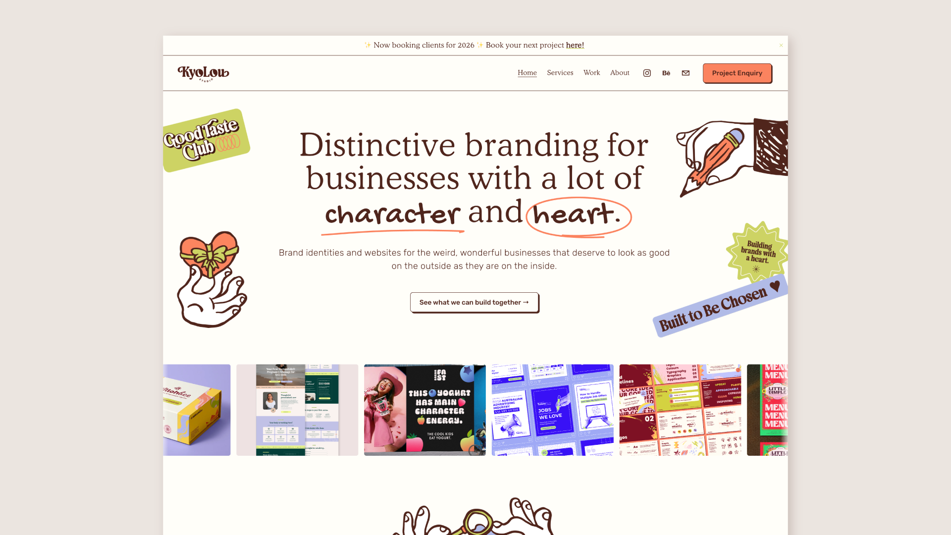
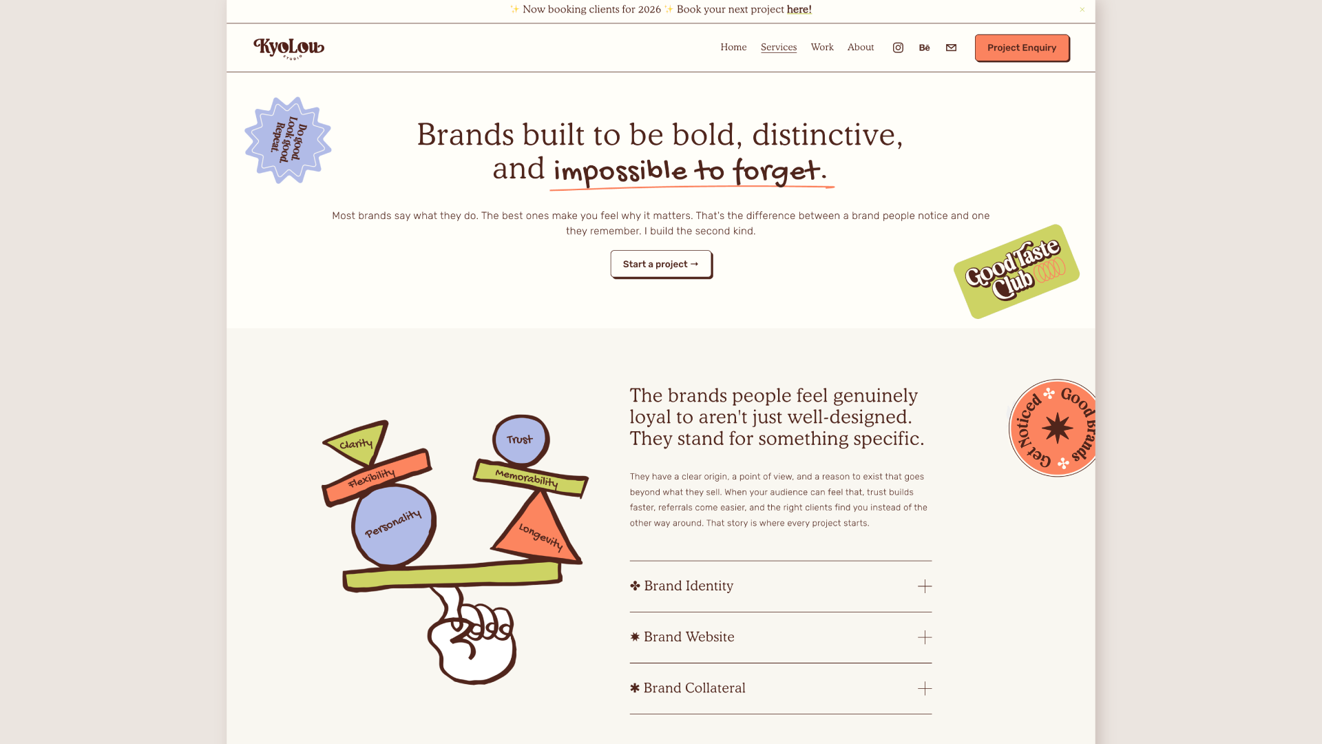
My brand needed to speak louder to the people I actually want to work with, ones after an identity that's quirky, expressive, and full of personality. Illustration is part of what I offer, and I wanted that known. But the brief I set myself was harder than it sounds: the illustrations couldn't just look good, they had to show how I think, how I approach branding, and why someone should choose me over another designer. Most branding graphics don't attempt that. They're decoration.
Solution
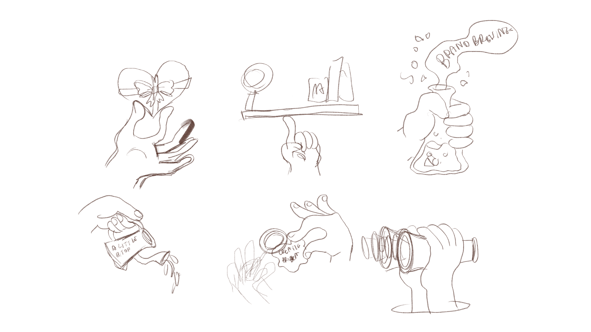
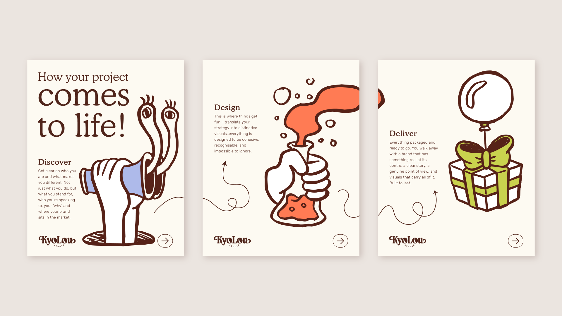
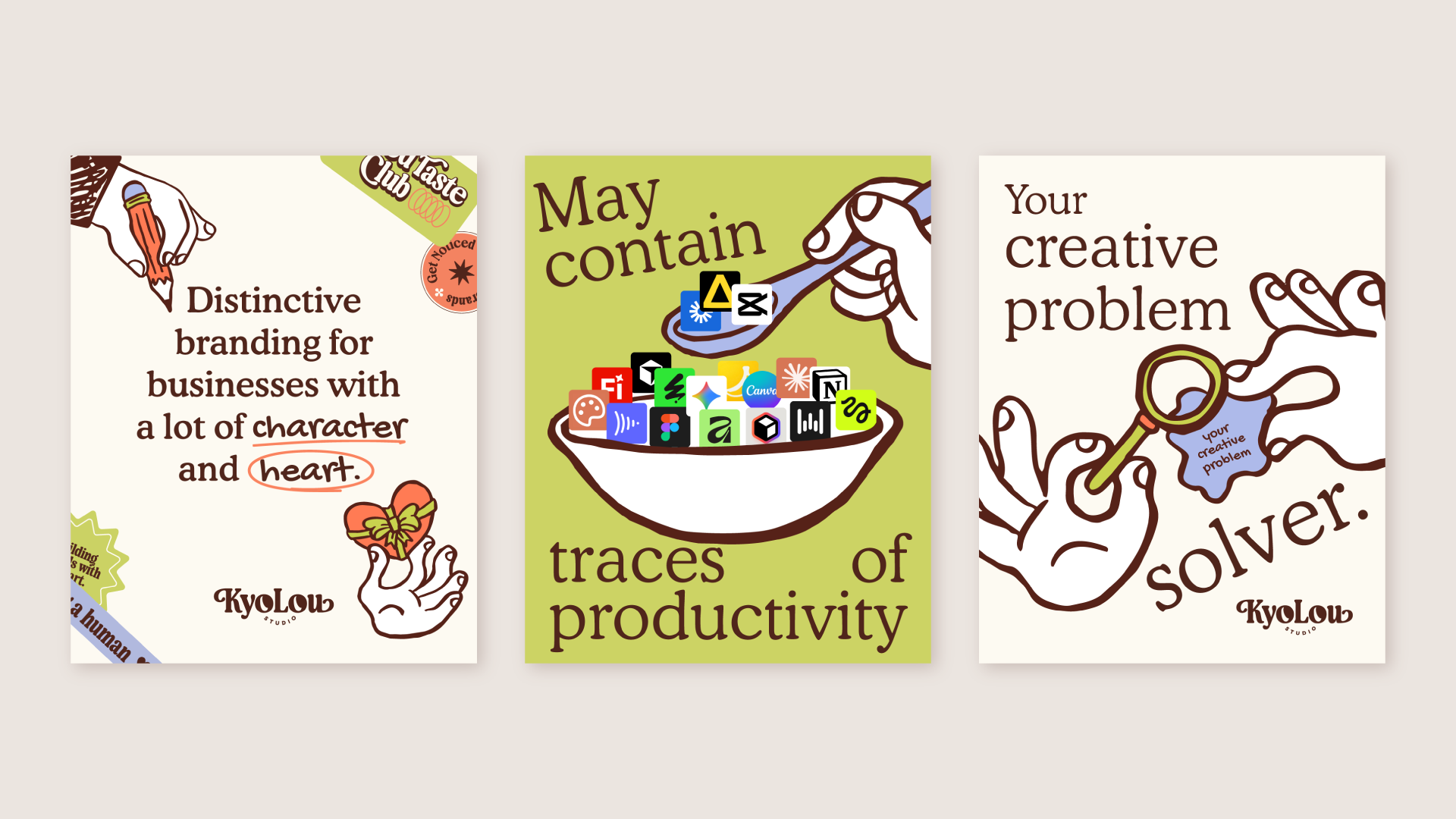
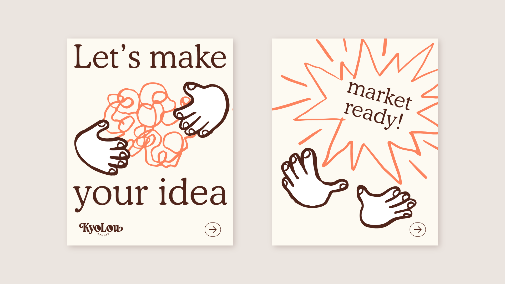
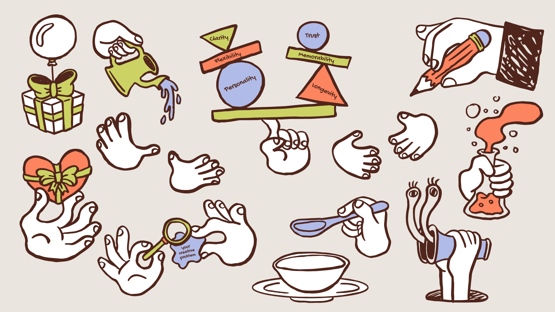
I started with a list of branding-adjacent words, brand, creativity, nurturing. It came back generic, nothing illustratable. So I flipped the question and asked what actually makes me different, then broke each answer down. I build distinctive brands with character and heart. I solve creative problems. Strategy and design happen in one head instead of being handed between people, and that shows in the work. I'm a storyteller who likes brands that feel human in a world getting more artificial by the day. Hands became the thread that tied it together. They take things apart, inspect them, connect them, build them back up, which is genuinely how I work. It's also a nod to the fact that these are hand drawn, not generated, which is part of what makes the work mine.
Style-wise, I went chunky and bold on purpose, a deliberate contrast to Cooper, my typeface, which sits light and delicate. The two ends of the spectrum create hierarchy without competing. I illustrated on iPad, brought everything into Illustrator, then layered in my brand colours to tie it back to the wider system.
Result
A visual language that communicates how I work while proving I can illustrate. Some pieces could be pushed further with more time. Between client work and everything else, I'm happy with where it landed for now, and I'll revisit when it's worth revisiting.
Services
Ideation, Illustration, Personal brand, Brand personality, Graphic Elements