MARÉ
Carrying Portuguese heritage into the present.
Problem
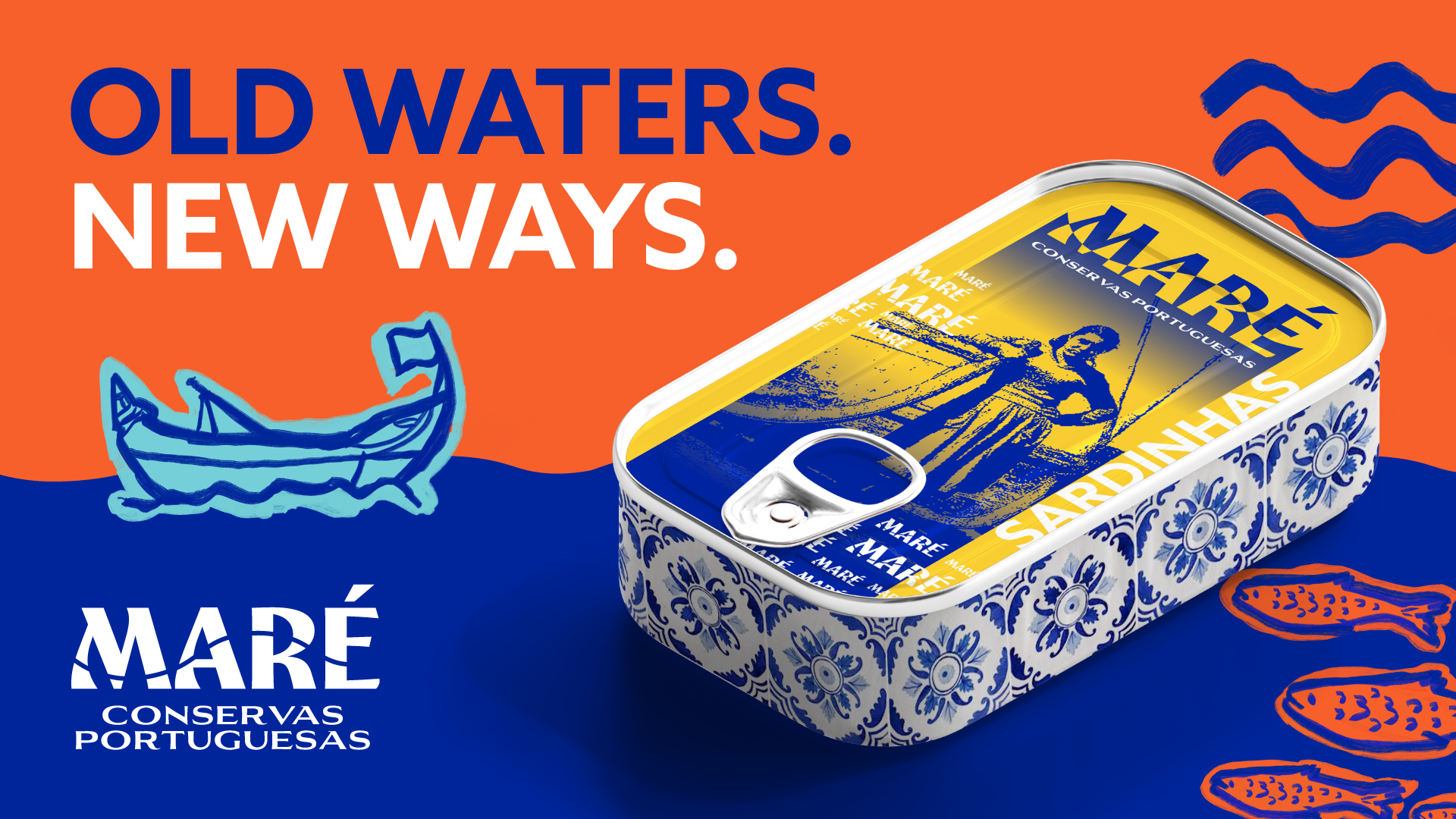
MARÉ is a contemporary Portuguese conservas brand inspired by Portugal's rich tinned seafood tradition. The challenge was to celebrate that heritage without becoming another vintage sardine brand. Portuguese, but not nostalgic. Contemporary, without losing where it came from.
Solution
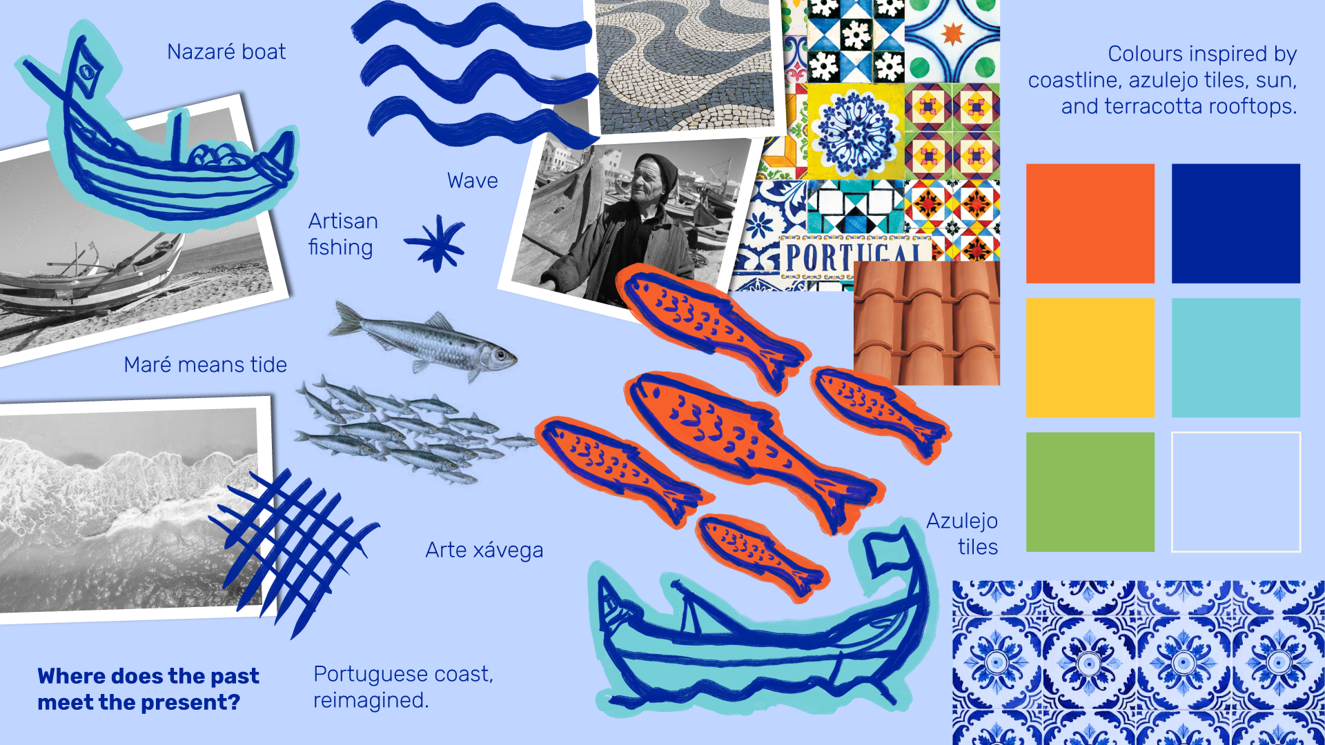
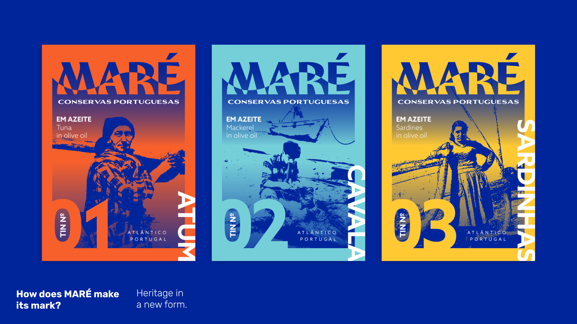
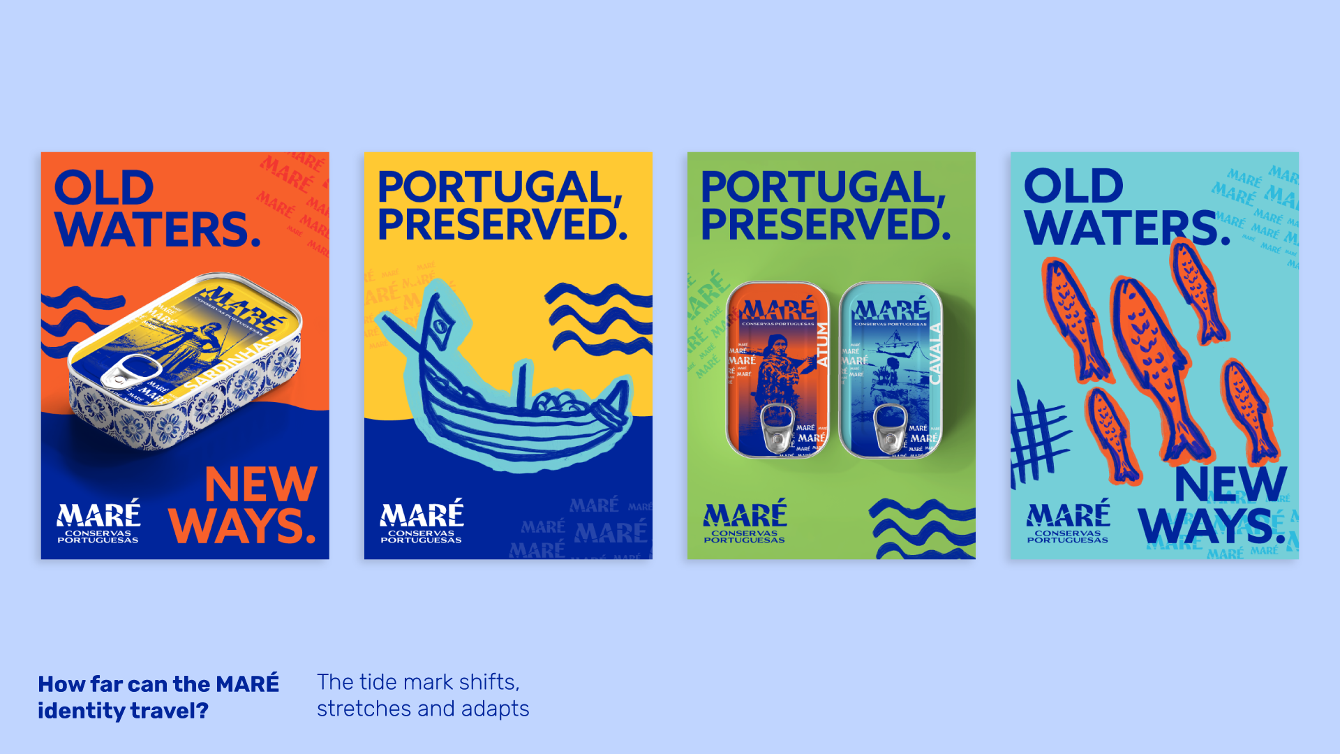
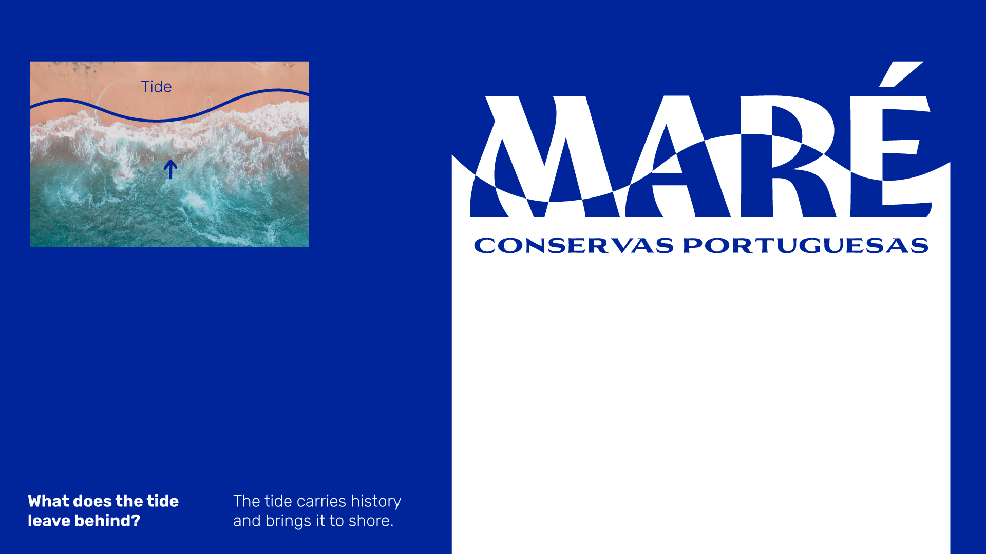
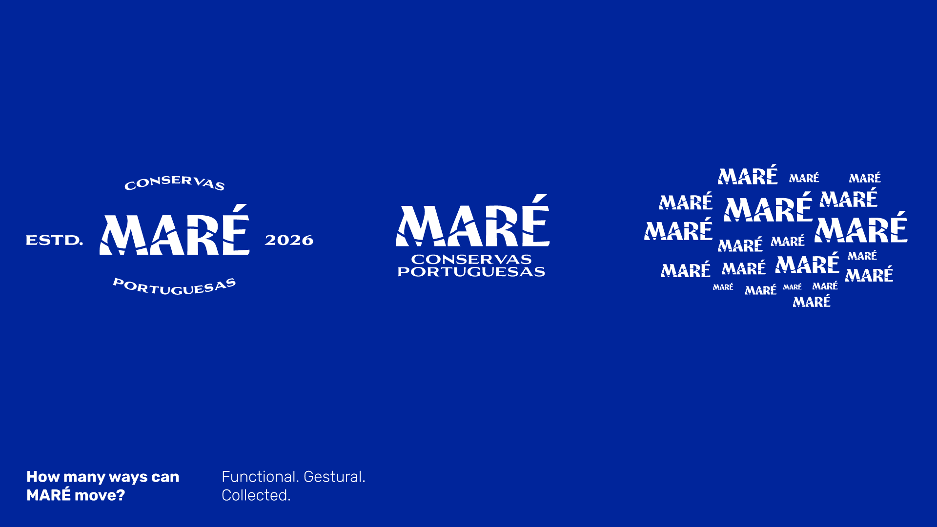
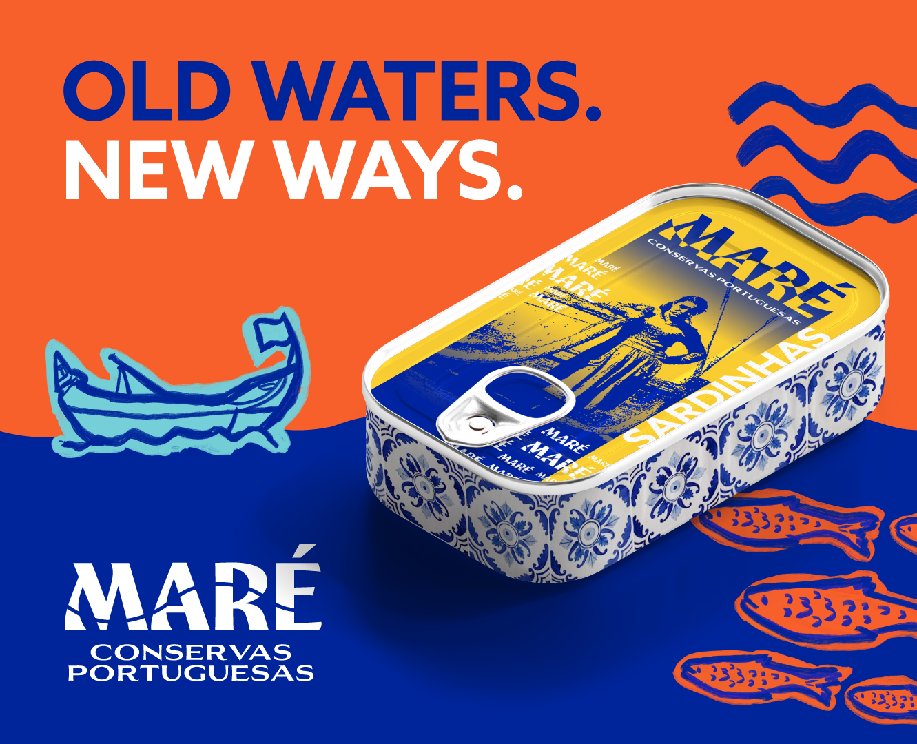
I started with the name. MARÉ means tide. The tide moves between the ocean and the shore, bringing things in, revealing what was beneath the surface and leaving traces behind. It became a natural metaphor for how heritage moves through time. The past leaves a mark on the present. I drew from archival photographs of 1950s Portuguese fishermen, boats and coastal life, digitising and reinterpreting the imagery through a contemporary lens. The distinctive tide mark became the key visual device, appearing across the logo, image system, packaging and brand applications. Old forms pass through MARÉ and emerge as something new.
Services
Brand strategy, visual identity design, logo suite development, art direction, packaging design, social campaign assets