Sakina Wellness Spa & Clinic
From DIY to deeply trusted in pregnancy wellness.
Problem
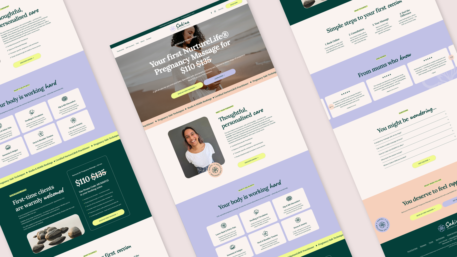
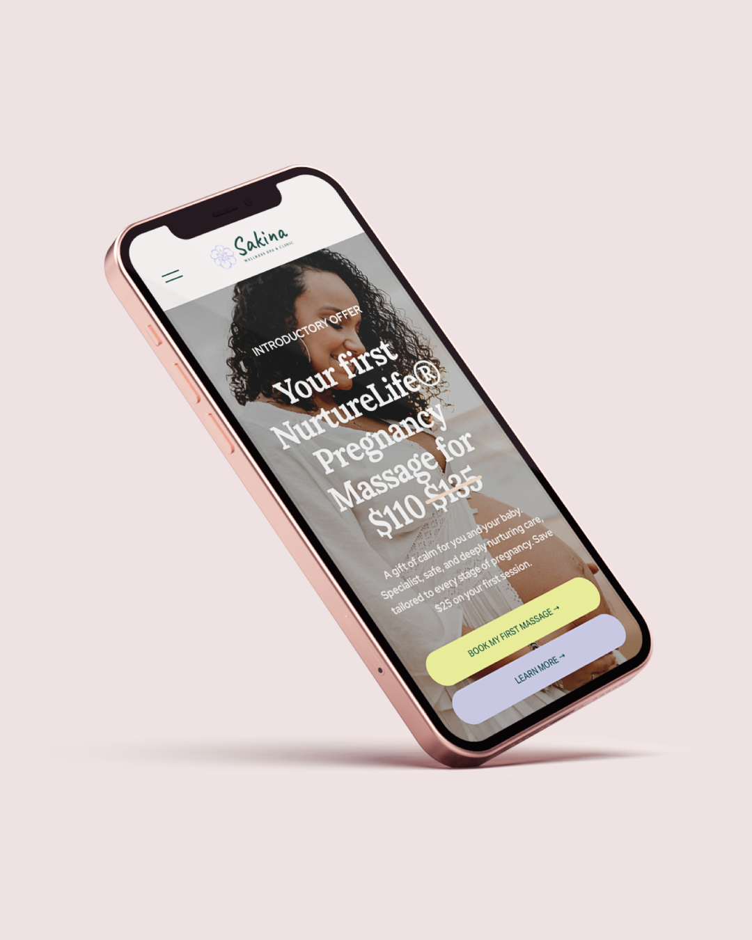
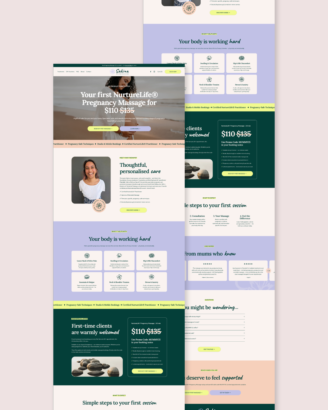
Sakina had real expertise. But the brand didn’t show it. Logo hard to read at smaller sizes. Uninspiring website. Unclear positioning. Pregnancy massage was the core service, but you couldn’t tell in the first few seconds. Compared to other local clinics online, it felt inconsistent and less trustworthy. She needed to communicate one thing clearly: You’re safe here.
Solution
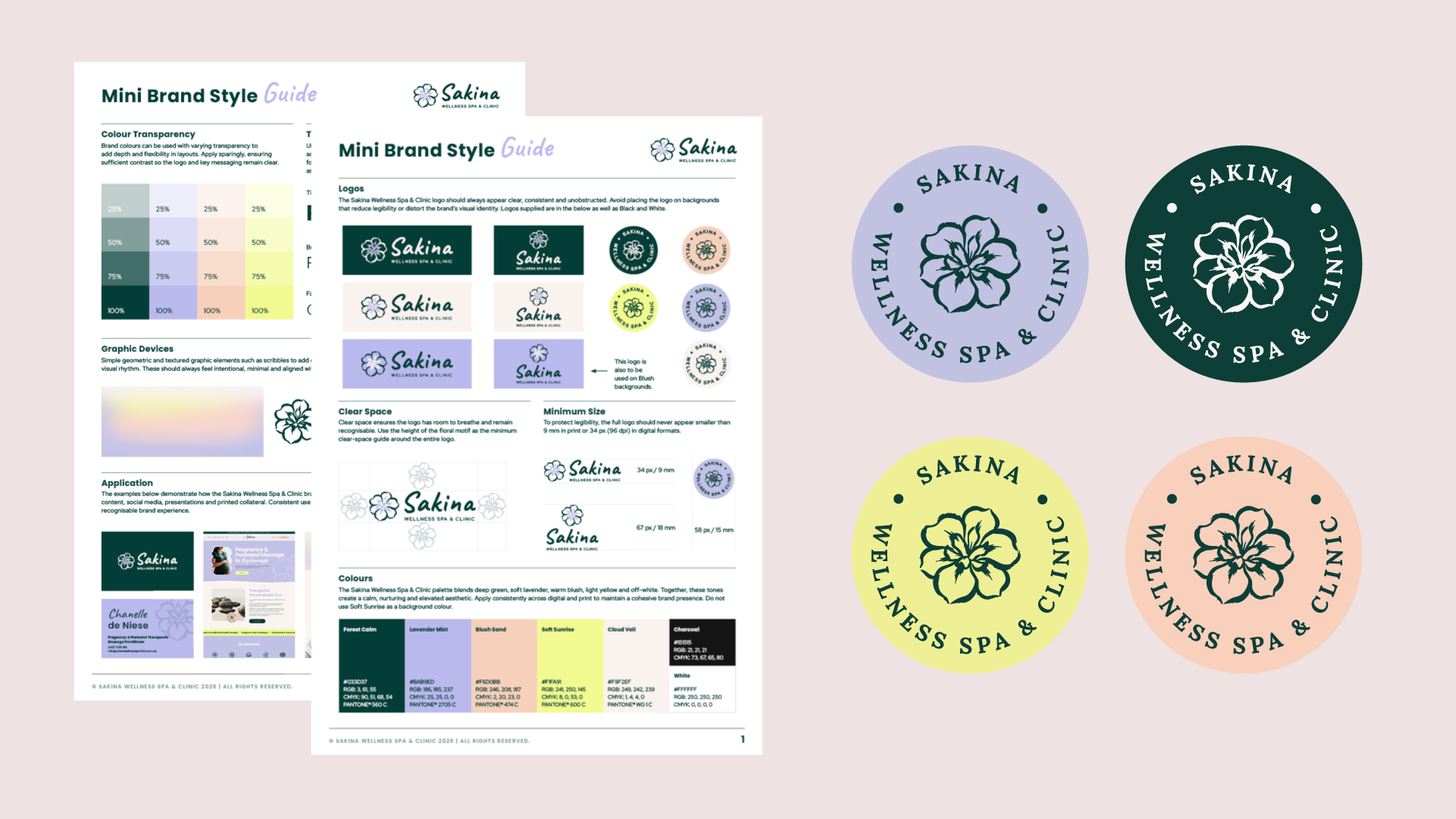
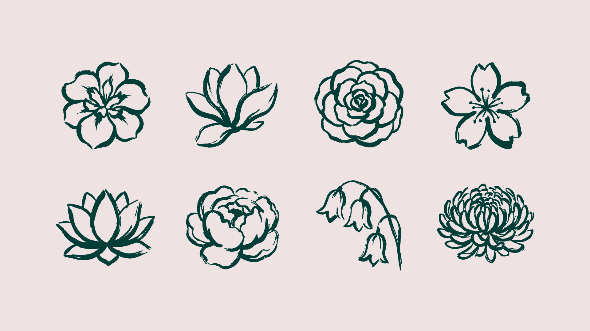
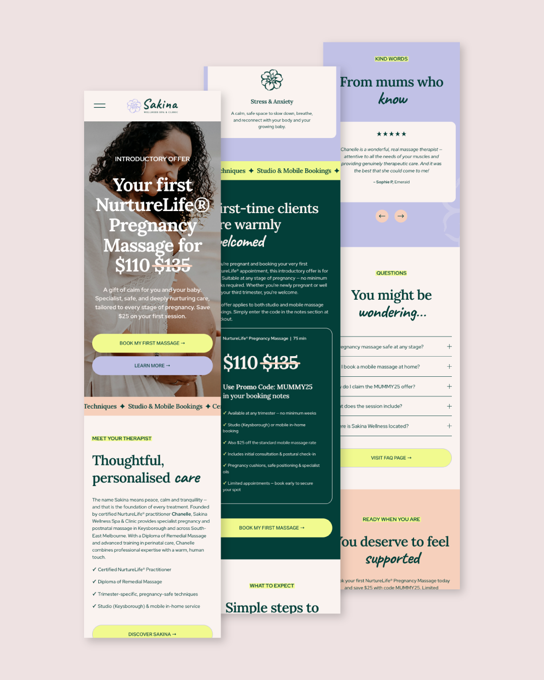
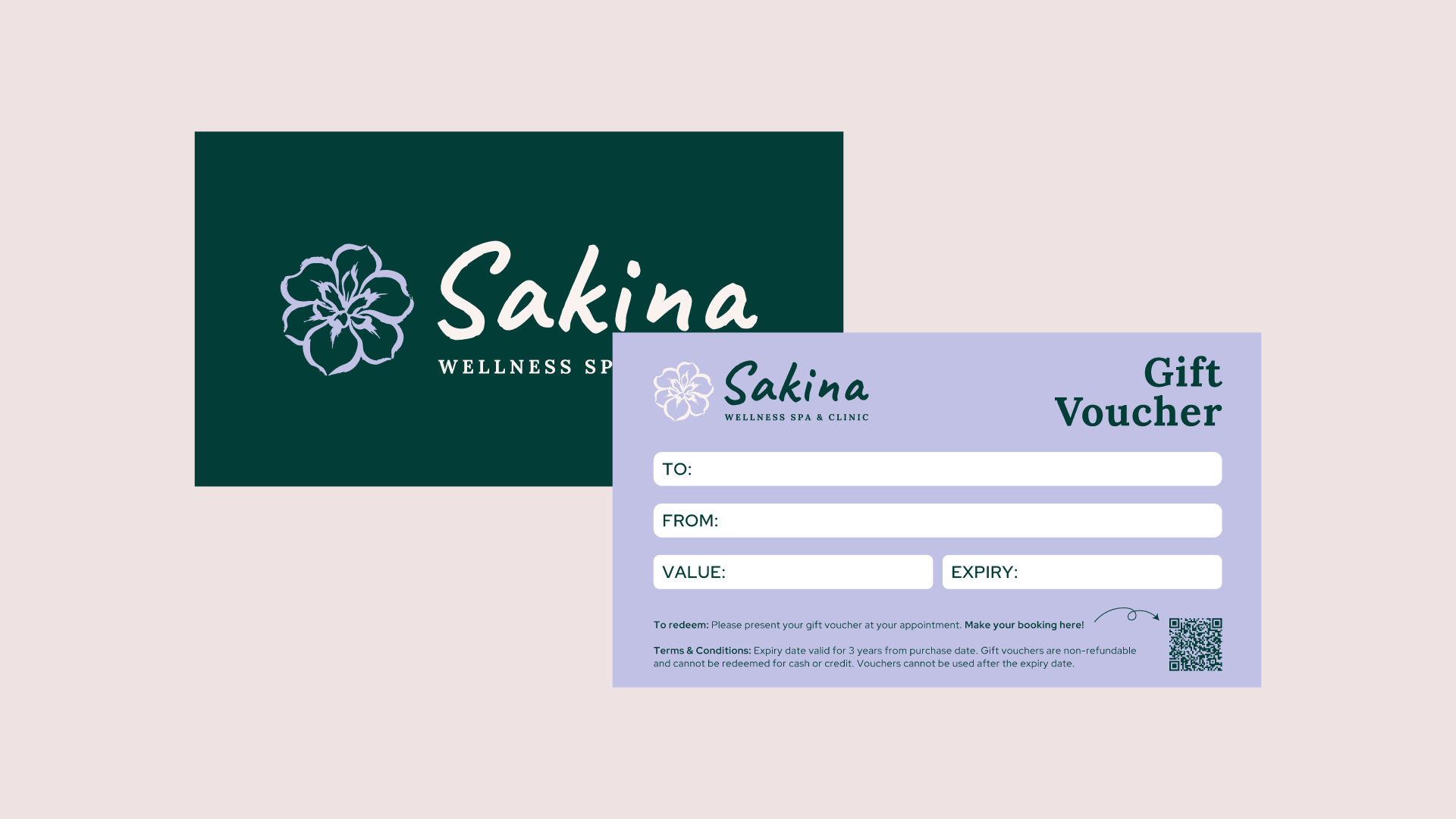
A refined, approachable identity grounded in calm and safety. Soft colours and gentle typography create warmth and reassurance, intentionally avoiding a high end feel to reflect a friendly, local pregnancy clinic. Custom floral ink illustrations were created for each service, drawn in an organic, flowing style and vectorised for consistency. Clear messaging and a simplified booking journey build confidence. Now the brand feels as nurturing as the care itself.
Results
Since launch, 69% of visits come direct, meaning people search for Sakina by name rather than stumbling on her by chance. Of everyone who views a service online, 66% add it to their cart, a conversion rate well above typical service-site benchmarks.
Services
Brand strategy, Visual identity design, Logo refinement, Custom illustrations, Website (Squarespace)